Guest Post: Marc Aronson and the Design and Flow of Nonfiction
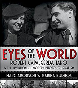 It is difficult to pin down the first time I became aware of the work of Marc Aronson. The likelihood is that it occurred when I read his books. Or was it his work as an Assistant Teaching Professor in the School of Communication and Information at Rutgers University? How about his support of international children’s literature and translations? Regardless of how I came to him, I always find the work that he does engrossing. Today’s post is no exception. In 2017 Marc is publishing the book Eyes of the World: Robert Capa, Gerda Taro & The Invention of Modern Photojournalism, which he coauthored with Marina Budhos (on shelves March 28th!).
Ladies and gentlemen, Mr. Aronson!
Hello all, thank you Betsy for giving me this space to talk about an aspect of books for young readers that does not often get attention: design and flow in nonfiction that uses archival images. I’ll begin with a bit of Children’s Book background and then show how that fits my theme.
I began working at (then) Harper & Row Children’s Books as an assistant editor back in the 1980s From the first day that I joined Charlotte Zolotow’s department I was schooled in the interplay of art, text, and design. This is of course most true in 32 page picture books when words, images, design, and, especially page turns are a unity – as Brain Selzinck so eloquently reminded us in his 2008 Caldecott speech (http://www.theinventionofhugocabret.com/brian_speech.htm). This understanding of a book as a physical object is not solely the preserve of the picture book (as Hugo Cabret of course demonstrated) it is equally present in the best middle grade and young adult photo illustrated nonfiction. Yet in nonfiction images are too often described as “illustrations” – nice to see the Eiffel Tower near the reference to it in the text. No, in really good photo-illustrated nonfiction books text, image, and design are as carefully and narratively linked as in a 32 page picture book – yet we cannot create any images, images generally need to fall in chronological (as well as visual) sequence, and we must work out the design over 100, 200, even 300 pages.
Let me take you into the process. Marina and I have just published Eyes of the World: Robert Capa, Gerda Taro and the Invention of Modern Photojournalism (Holt, 2017). Recounting the desperate, tragic, heroic lives of Capa and Taro we (along with our brilliant designer April Ward and devoted editor Sally Doherty) needed to consider every page and page turn as textual description interwoven with visual narration. This required three separate processes: first, we wrote the main text – which needed to work entirely on its own, as propulsive narrative. But in order to write the book, we immersed ourselves in Capa’s and Taro’s contact sheets, prints, and magazine layouts – living in their sequences of shots (the two-volume Mexican Suitcase book published by the International Center of Photography is invaluable for those who want that deep dive). Images and sequences of images thus inspired words.
Second, we had to locate and select every image that we wanted to show – we had resolved the rights issues, but we still needed to find who had each image (this was not always clear, even to the rights-holders). Third, came the real challenge: designing each page, page-turn, and chapter so image plus text would have the right pace – chapters were by turns romantic, hectic, celebratory, cinematic, meditative, bellicose, tragic, triumphant and, finally both culminating and inspirational– leading from the story we’d told to now, the present, the future. While images had led to words in stage one, in stage three images plus words needed to create a narrative unity. We needed to plan each block of text, each image placement on a page, and each page turn, to suit and to convey the tone and mood of that beat of the story.
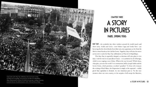
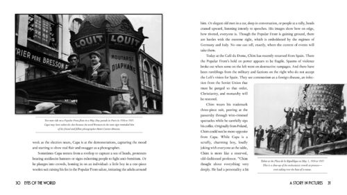
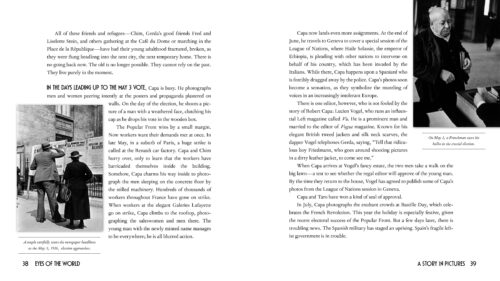
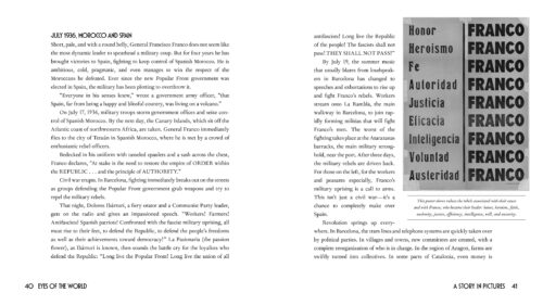
Here is one example: in Chapter Three Capa is finding his footing as a photographer as France hurtles towards a crucial election pitting nativist, anti-immigrant, populist proto-fascists (writing this book during our elections created a powerful sense of reliving history) against the Popular Front of the Left. Once the Left won, a series of strikes broke out, even as a parallel clash of Left and Right in Spain erupted into Civil War. The chapter needed to show images of all of the forces, plunge readers into the intense atmosphere of expectancy and peril, and feature Capa’s unique ability to capture both the passions of crowds and the unusual, intimate sensibilities of individuals.
As in any book about an artist, the images must simultaneously reveal the creator’s skill and development, depict the artist’s lived experience, and immerse readers in the mood and pace of that link in the overall story.
How?
We open with a vast crowd shot at the Place de la Republique (the precise site of the Charlie Hebdo rally as we were writing the book).
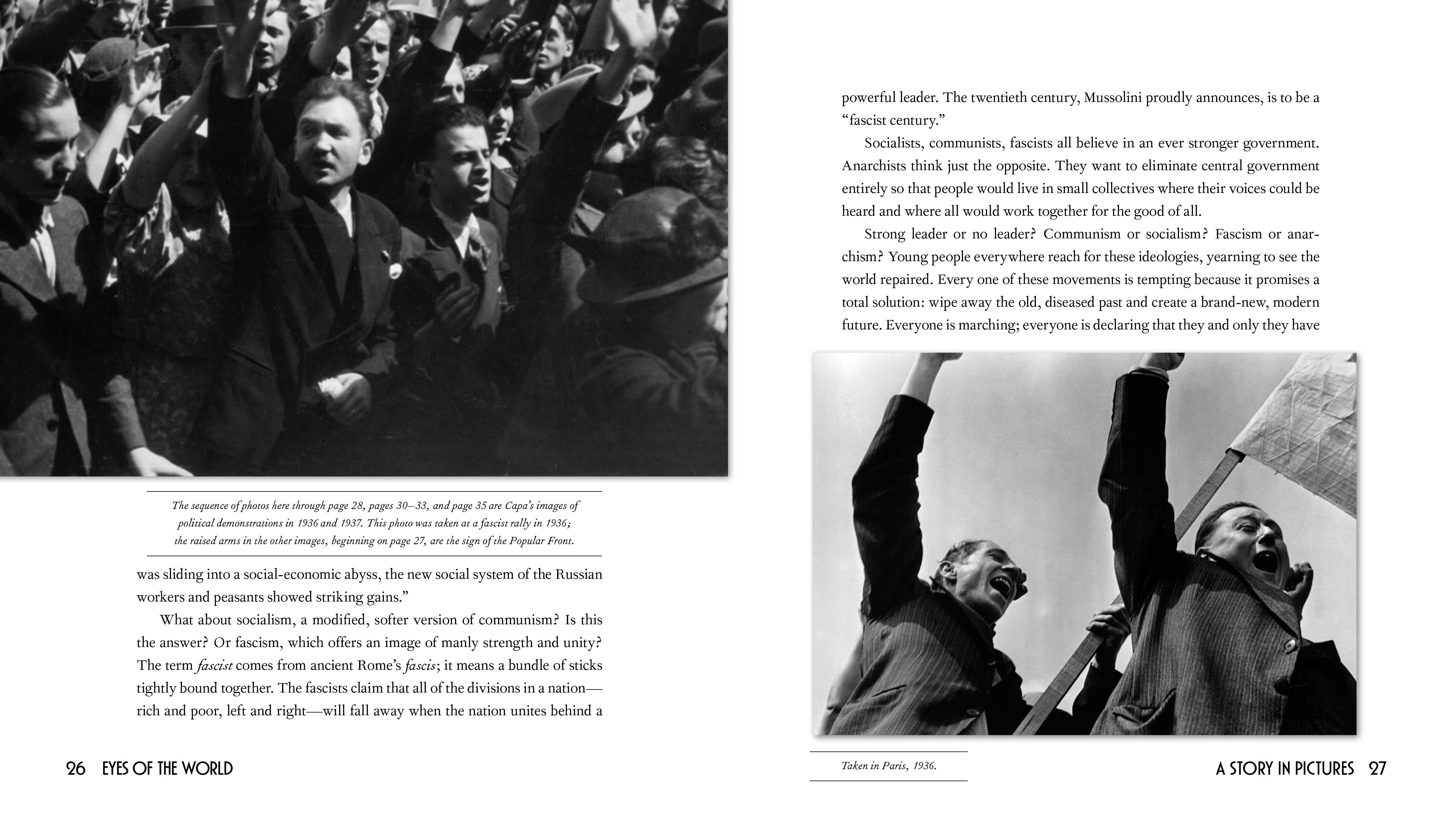
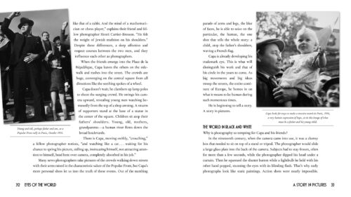
Page turn: fascists salute facing Popular Front salute;
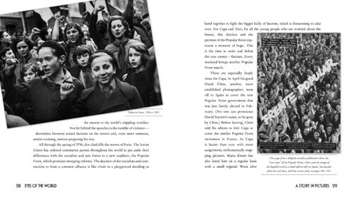
page turn; children salute facing Popular Front image (introduces Chim, our third photographer, and is linked to a later issue about the use of images in propaganda).
Page turn: Capa’s sly humor showing how people occupied every nook and cranny at rallies, two men on an awning, with a possible pun in a shop sign, facing a close-up of protesters clustered around the base of a statue (or perhaps rally a year later, no expert is sure).
Page turn: father and son at a rally facing father and daughter at rally.
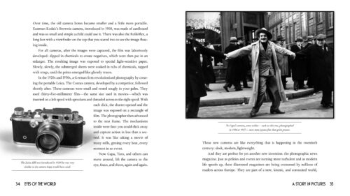
Page turn: Capa’s camera (we could only find a Leica a year after his) facing more Capa wit – a striker as gleeful performer.
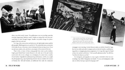
Page turn: across a spread the many faces of the strikers – playing cards, sleeping, getting food packages from their wives.
Page turn: a couple reading election posters facing a man casting his vote.
Page turn: the fascist revolt breaks out in Spain with Franco at its head.
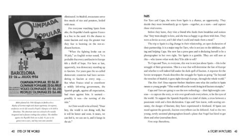
Page turn: the People’s Olympics, cancelled by the outbreak of Civil War.
As Robert Warren, the editor I first worked for at Harper, had told me – you should be able to “read” the chapter just through the pictures and their captions.
When we were at the very end of the design process, we went over the book page by page with Cynthia Young, who is both a leading scholar of our photographers and the curator at the International Center of Photography. She told us that Capa and Taro deliberately chose not to travel through Spain with the many famous reporters and writers there. They did not want their images to be mere illustrations adding gravitas to words. Rather, they shot and selected images to be visual narrations, stories in images with their own pace and rhythm – that is what we tried to create in the book. And that is what many middle grade and YA nonfiction authors such as Jim Murphy, Tanya Lee Stone, Candace Fleming, Susan Campbell Bartoletti, Betsy Partridge, Martin Sandler and others do in theirs.
ICP has placed 119 of the images on a site, so you can explore the photos as photos. Here is the link: https://www.icp.org/browse/archive/collections/eyes-of-the-world
I hope I have helped you to see photo illustrated nonfiction with new eyes.
Thank you, Marc, for this valuable insight. As someone who had to secure photo rights for her own book (Wild Things: Acts of Mischief in Children’s Literature) but didn’t think in terms of page design nearly as closely as you did, this is invaluable.
RELATED
The job outlook in 2030: Librarians will be in demand
The job outlook in 2030: Librarians will be in demand
ALREADY A SUBSCRIBER? LOG IN
We are currently offering this content for free. Sign up now to activate your personal profile, where you can save articles for future viewing



Add Comment :-
Be the first reader to comment.
Comment Policy:
Comment should not be empty !!!