A Is for Aspirational: Library Design for Developing Ambitions | Editorial

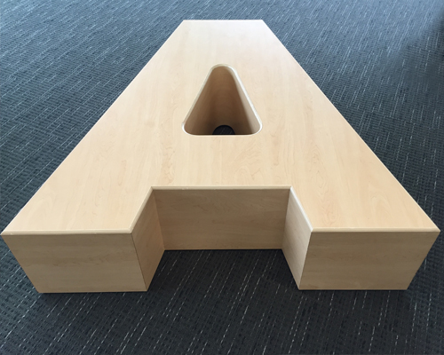
The letter A makes a fine shape
for a wooden bench.
I wished I were a child again when I walked into the Parsons Branch of the Columbus (OH) Metropolitan Library (CML) last month. The building is striking at first glance, with lovely stonework and glass supporting an almost winglike roofline, plus an interior that holds a special promise for any patron, and especially kids. The promise is that this is a place that will help you thrive.
The floor plan echoes the progression of life, with a children’s program space anchoring one end nested with a section dedicated to Ready for Kindergarten—complete with a mini-Columbus Schools bus to drive or ride in, and a big wooden bench in the shape of the letter A (pictured).
That A reinforces CML’s focus on the fundamentals. Among its guiding principles for the system’s new buildings: “Young Minds: The children of our community are our top priority and our buildings will reflect this commitment.”
Dedication to what kids might need is apparent as one moves north through the building, with children’s and tween sections giving way to a partially enclosed room for homework help—those two words call out though the glass partition from a bright and hip green wall inside the enclosure. But, the aspiration on behalf of kids doesn’t stop there. Once in the homework help room, children see a beacon of the future in the words “to and through college” on a facing wall.
That homework room is one of the first things a patron sees when entering from the parking lot, front and center by the circulation desk. In that place of pride and priority, it signals that the homework era is one step in the lifelong relationship with the library.
The progression continues with a teen room off-center further north, learning labs, meeting rooms, private study rooms, and a section of public computers beyond a prominent fiction and nonfiction collection, and is anchored on the far end with a fireplace and glassed-in quiet room.
Here, learning and progressive readiness for whatever is next is expressed in attitude and explicit in the design. So far, the numbers show that the investment in this kind of space is paying off, according to literature passed out during the tour, which was part of Library Journal’s Design Institute held May 5 at CML (see more images below). Instances of homework help increased by 30 percent in the six months after the branch opened on June 4, 2016. In the same time frame, the branch also has seen a nearly 75 percent rise in checkouts of children’s books, and the number of Reading Buddies sessions has tripled at Parsons.
That A bench is stunning, and a fun way to engage a small child in the alphabet, as is a wall mural of the letters themselves. An oversize green K alongside them signals what zone you are in. The design is playful, because learning is fun in this kind of space, as it should be. Importantly, it is just a start.
At the Parsons Branch, the transparency we celebrate in libraries is made manifest in the design. It literally helps patrons see ahead, anticipate the next step, and aspire to fulfill dreams. The library itself expresses wayfinding for life.

Rebecca T. Miller Editor-in-Chief rmiller@mediasourceinc.com
All photo's shown by Rebecca T. Miller
[portfolio_slideshow showtitles=true]
RELATED
The job outlook in 2030: Librarians will be in demand
The job outlook in 2030: Librarians will be in demand
ALREADY A SUBSCRIBER? LOG IN
We are currently offering this content for free. Sign up now to activate your personal profile, where you can save articles for future viewing


Add Comment :-
Comment Policy:
Comment should not be empty !!!
Heather Hawryluk
We are presently fundraisingfor a new library - would it be possible to see the actual floor plan of the building?Posted : Jun 22, 2017 08:40