

2018 School Spending Survey Report
The Cover Story: Behind every great cover is the promise of a good book
What goes into an exceptional book cover? Betsy Bird investigates.
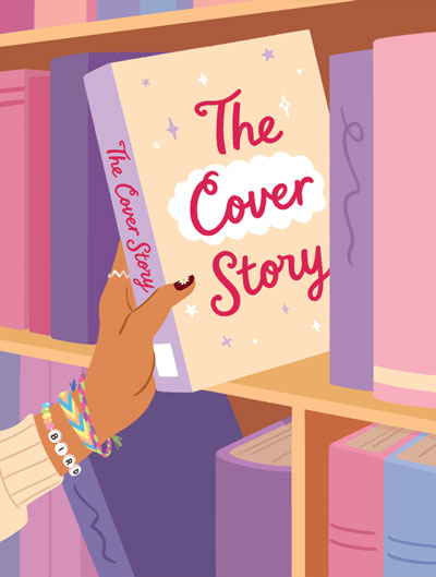 |
Illustration by Jacqueline Li |
“Don’t judge a book by its cover,” the old adage says.
Suuuuure.
Forgive me, but we’re all just human here. Look me in the eye and tell me that you’ve never automatically rejected a book with an egregiously awful cover. As any children’s bookseller or librarian will tell you, images that grace a book’s cover or jacket (the separate paper wrapper that protects the cover) have the unenviable job of selling a story to a child. A strong book talk or hearty recommendation only gets you so far when the kid is facing something, say, tinged sepia (notoriously the most difficult color to get a kid to read).
It wasn’t always that way. Dust jackets on books were first introduced in the 1830s with one purpose alone: to keep books clean. This in an era of ubiquitous coal dust and grimy little fingers. The general idea was that once you bought the book, its outer wrapper was to be tossed aside. It wasn’t until the 1920s that the images on those jackets became so interesting that people didn’t want them to be thrown away anymore.
Today, the cover of a book is all about marketing. It is also a key to larger trends. As Steven Heller and Seymour Chwast put it so succinctly in Jackets Required: An Illustrated History of American Book Jacket Design, 1920–1950, good book jackets are “indicator[s] of popular culture,” serving as “signposts of a period’s aesthetics.” Those aesthetics stay with us long after we’ve grown up.
Many of us remember fondly the book jackets of our youth. I have little difficulty calling to mind the ’80s/’90s realism of The Baby-sitters Club or those Wrinkle In Time paperbacks brought to life by a slew of different artists.
But trends change. What might have sold a book, even as recently as 10 years ago, may not appeal at all to the children born at that time. Additionally, the cover needs to appeal to everyone at once. Done correctly, you’ve hit the marketing sweet spot with a book jacket equally enticing to both kids and adult gatekeepers. Done poorly, you may have just doomed a book to obscurity. The distinction is often razor-thin.
Creation
What makes a good book jacket? No doubt we all have our own personal opinions, and often, it’s easier to say what makes a bad cover than a good one. Take a book where the publisher has little faith in the product. Generic images, or ones that don’t have anything to do with the plot, may cause book sales to suffer. Yet even the worst cover you see on the shelf was probably subjected to a rigorous vetting process.
A book cover is one thing in all of publishing that every single department touches. There’s nothing else; the manuscript, illustration, marketing, and other aspects of the work in question come from different departments. Only the book’s cover is subject to this review, since it must serve many different purposes and please many different people.
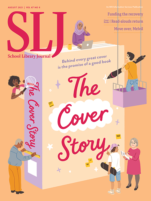 |
"The Cover Story" is SLJ 's August 2021 cover story! |
Chad Beckerman, illustration agent and former creative director at Abrams Kids and Comic Arts, knows that a book’s design team bears the responsibility of everyone’s comments. “The most successful covers are ones that tend to be from teams that know how to take comments from sales, authors, editors, and the marketing teams and listen to what they are suggesting while still aiming for a cover that is true to the book and is a visually interesting image,” he says. “The process of a cover at times can pack too much into an image in service of a comment. It’s the job of the design team to take these comments and funnel them into a new direction without sacrificing an image that grabs the consumer.”
And how do you gauge success? Well, a successful book jacket stands out, doesn’t look derivative, and clearly displays its genre on its sleeve. Freelance designer Marcie Lawrence sees it as the perfect mix of what is pleasing to the reader and what is pleasing to the designer: “Personally, the covers I like integrate the type and the image. It’s more of a feeling for the reader, but I’m judging how they lay the type and what they did with it. I like loud designs. I like really bold neon colors and huge type.”
That “feeling” for the reader is an ineffable thing to reach for. And as Laurent Linn, art director at Simon & Schuster Books for Young Readers, says, it has to “distill the emotional essence of the story on the cover.” For him it’s also about the emotion it evokes in the reader, as well as the subject and theme. That’s a tricky balancing act, though. Covers that overexplain their story won’t instill that necessary sense of wonder and curiosity in their readers. That’s why many covers opt for a visual metaphor to communicate the emotion of the book rather than illustrate a specific scene or moment.
Trends
Any trip to the dustiest corner of a library or a particularly well-stocked used bookstore will yield a treasure trove of unfortunate covers of the past. And even covers that wouldn’t strike you as particularly old frequently come across as problematic. Remember the oodles of middle grade novels from a decade ago that would put their Black main characters in silhouette, rather than display their race proudly? Then there were the cover controversies. In 2009 advanced reading copies of Justine Larbalestier’s book Liar were released with the image of a long-haired white girl on the cover. The problem? The main character of Liar is a short-haired Black girl.
Larbalestier spoke out against the whitewashing on her blog. In a relatively short amount of time, the publisher backed down and presented a new cover, this time featuring a Black character, but the stain of that first cover lingered.
These days, representation still has a distance to go, but things are getting better. Fewer silhouettes, for one. But while it can be easy to identify the trends and styles of the past, it can be much trickier figuring out why books look the way they do today. For Lawrence, however, there’s a simple way to track cover trends: Amazon.
All those thumbnail images of book covers you’ll find on Amazon’s site provide a window into today’s decision-making and the results. When a book has to differentiate itself on a tiny scale, you don’t want it to look like any other cover out there. “Which is interesting,” says Lawrence, “because when you’re designing books, you [also] want things to look like what’s popular. So you have to tread the line to make sure the cover is different.” How do you do that? One way is to employ really bold colors. Make the thumbnail look important and the reader is more likely to click on it. That, in turn, will eventually get your book pulled to a top of a list, thanks to helpful algorithms. It’s reeling in those first clicks that’s the trick.

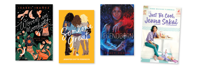
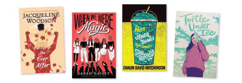
Another big trend? Illustrated book jackets. It wasn’t long ago that the bulk of novels, especially YA ones, sported photographic covers (remember the countless girls in gowns running away from the camera?). Now, everything is illustrated. Put another way, it’s “a wonderful time for illustration and illustrators,” Linn says. And this trend isn’t just for youth. Take a gander at the adult book aisle one of these days. Practically every contemporary adult romance looks like it’s taking its cues from the YA section. So why the sudden interest in painting, drawing, or other artistic rendering versus reality? Linn’s not sure, but he has a theory that it may be related to our fixation on social media and Instagram. Now that it’s so easy for us to see and make photos, we’re photoed out! Exhausted by the constant barrage of photography, we’re getting back to elements that are crafted and created by hand.
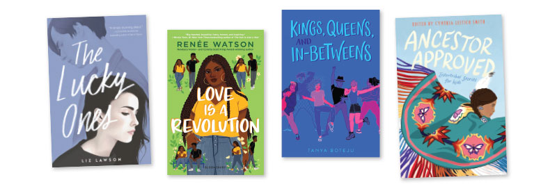
Perhaps that also explains the sharp increase in hand-lettered type. While retaining a slick and modern feel, designers are indulging in big bold type and hand lettering, particularly in the YA field. Think of books like With the Fire on High by Elizabeth Acevedo, Love Is a Revolution by Renée Watson, Just Be Cool, Jenna Sakai by Debbi Michiko Florence, or Ancestor Approved: Intertribal Stories for Kids, edited by Cynthia Leitich Smith. Much of this may have something to do with new technologies. Thanks to Photoshop and new printing techniques, type that looks handcrafted has never been easier. Not that it doesn’t have its problems. Beckerman notes that poorly placed type, the kind that fails to consider how to work with cover art, is a huge pet peeve for him. Like Lawrence, he feels that “Some of my favorite covers that I find to be successful are when the type and art are considered in the same thought,” he says. “This helps bring the reader into the world of the story.”
The future
The death of the book has been greatly exaggerated. No doubt you’ve heard people predicting it periodically. Why, not so long ago, the rise of ebook sales inspired some to declare that digital materials would spell the end of the physical book as we know it. What these naysayers failed to realize, though, was that the more you submit your life to the virtual, the more you begin to treasure the physical.
Linn puts it this way: “A book is something to hold. A beautiful object. So all the special effects (embossing, laminations, holographic foils) make it extra special. When you hold that book, you feel an ownership [of] that book. Especially children. They go to the shelf, they pull it off, sleep with it, chew it. The more tactile you make the cover the better.”
The physicality is just part of the allure. After all, every book cover tells a different story. Each one has to crystallize a complex story line into a single image.
Last but certainly not least, a jacket says a lot about the person reading the book. When you read it publicly or display it on your shelf proudly, you’re letting the jacket say something about you, the reader, who selected that book because you love it best. When book covers grab us, we grab them back in return. And when kids love a book’s cover? That affection lasts an entire lifetime.
Betsy Bird is currently collection development manager of the Evanston Public Library system. She blogs at “A Fuse #8 Production”.

Added To Cart
RELATED


RECOMMENDED
CAREERS
The job outlook in 2030: Librarians will be in demand
CAREERS
The job outlook in 2030: Librarians will be in demand
ALREADY A SUBSCRIBER? LOG IN
We are currently offering this content for free. Sign up now to activate your personal profile, where you can save articles for future viewing
ALREADY A SUBSCRIBER? LOG IN
Thank you for visiting.
We’ve noticed you are using a private browser. To continue, please log in or create an account.
Add Comment :-
Be the first reader to comment.
Comment Policy:
Comment should not be empty !!!